overview
The Human Rights Campaign is the go-to information resource for LGBTQ people and allies worldwide. Their website’s purposes are as broad as the organization’s initiatives: it’s the home base for their advocacy work, a place for updates on legislative news, and an information library for millions of people. As the lead UX designer and information architect for the website’s redesign, I worked to ensure that the new site conveys the breadth of work that HRC engages in, and its unique, indisputable significance to visitors.
Client
Human Rights Campaign, the go-to information resource and advocacy powerhouse for LGBTQ people and allies worldwide.
Scope of work
Redesign the organization's website, and separate 501c3 and 501c4 content into separate entities
Outcome
Updated information architecture and data model for better information scent and accessibility, served up in a flexible component-based CMS to suit the organizations future needs.
the problem
A web presence unable to house and effectively represent HRC's work
Through research, we discovered that the organization’s CMS and information architecture was overstretched, making it challenging for people coming to the website to find what they were looking for. We also learned that only about 7% of web visitors entered through the site’s homepage; most entered the site through articles and resources.
Identity
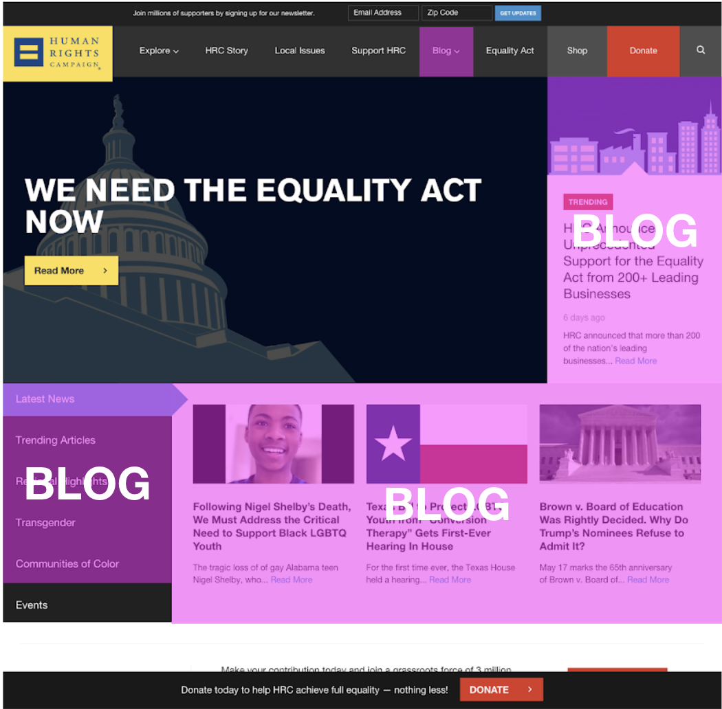
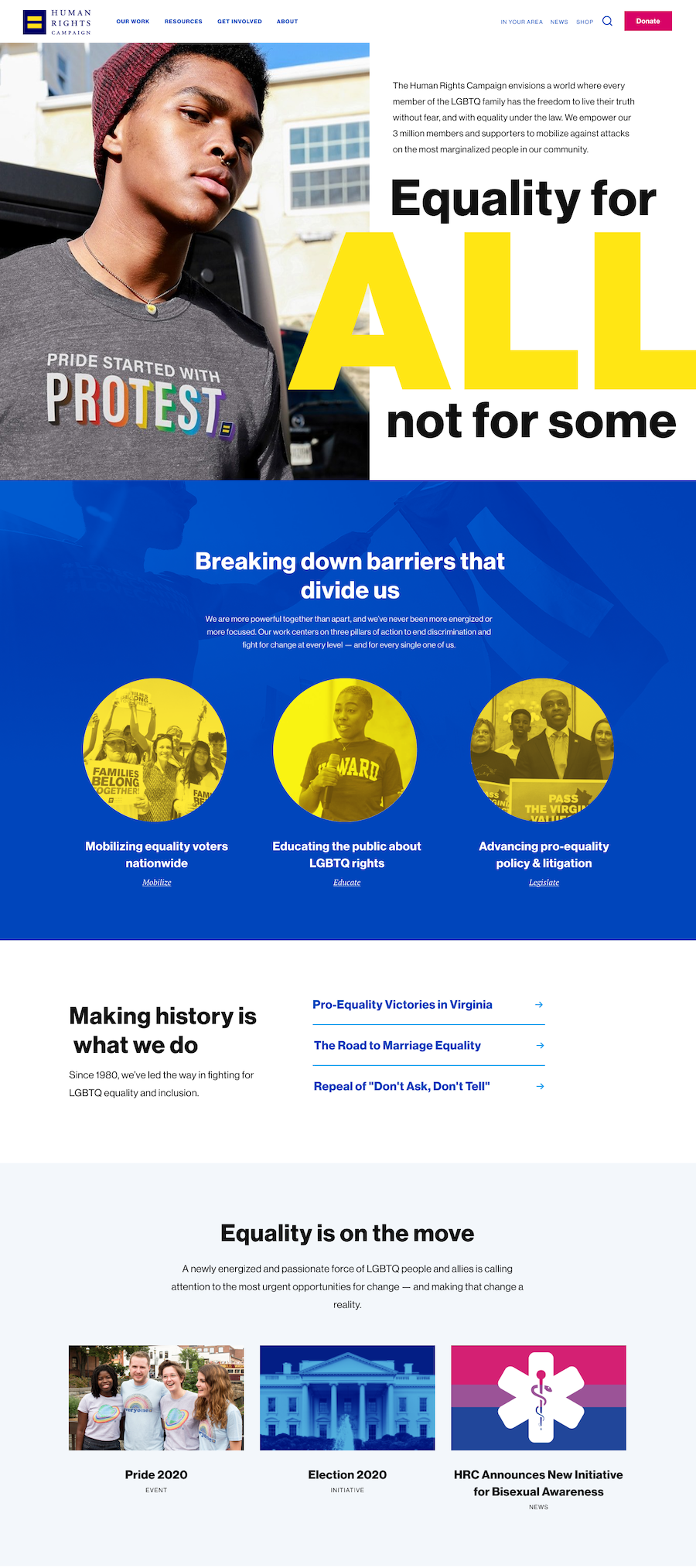
The existing site didn't effectively communicate what the organization does; the home page was very "newsy," making first-time visitors think that HRC was a news organization instead of an impactful agent of change.
Information scent
Important types of content, like resources, were hard to find. Moreover, the existing site did not account for the required separation of 501c4 and 501c3 content.
Accessibility
One of HRC's most powerful types of content, equality indices evaluating services and locations, existed largely in a PDF format.
the approach
Create a web presence that invests visitors in the organization
Because so many web visitors were coming into the site from articles and resources, the site needed to, by design, funnel them toward deeper engagement with the organization and its work.
Improving information scent
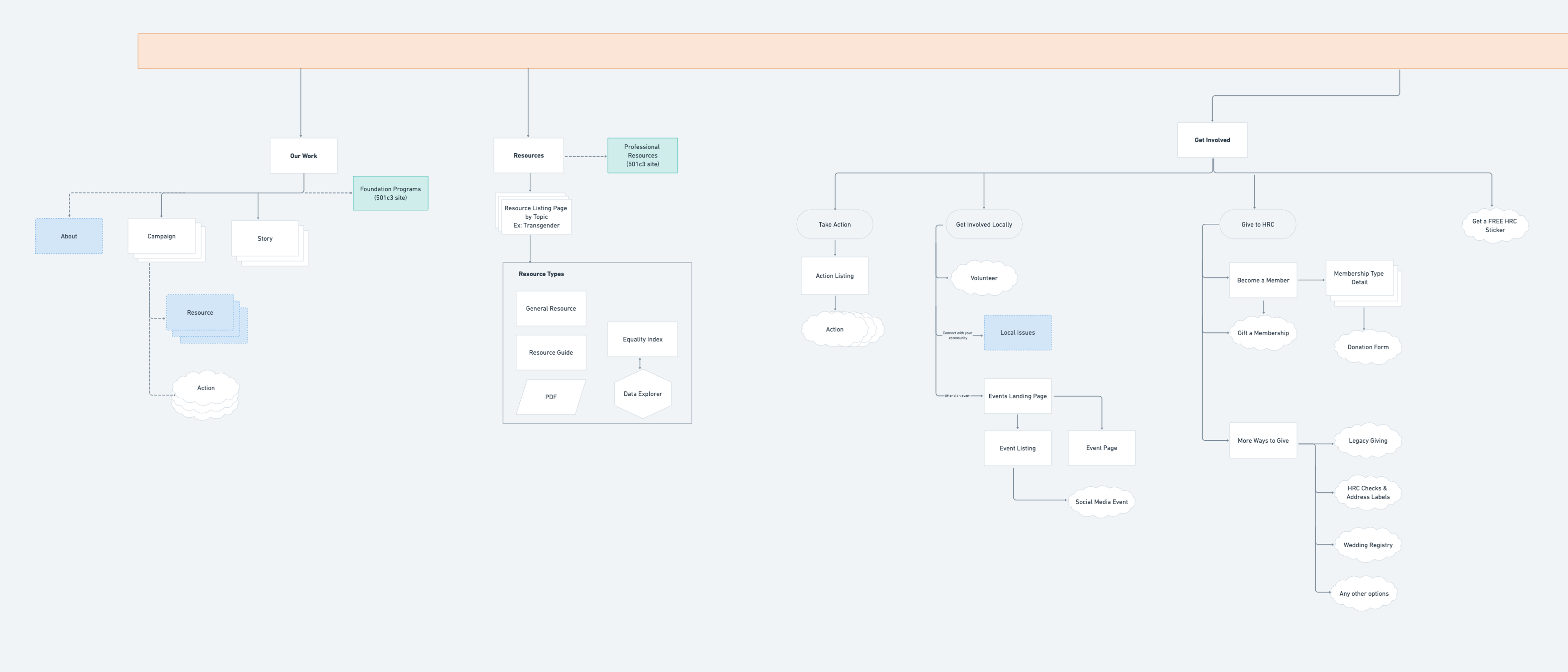
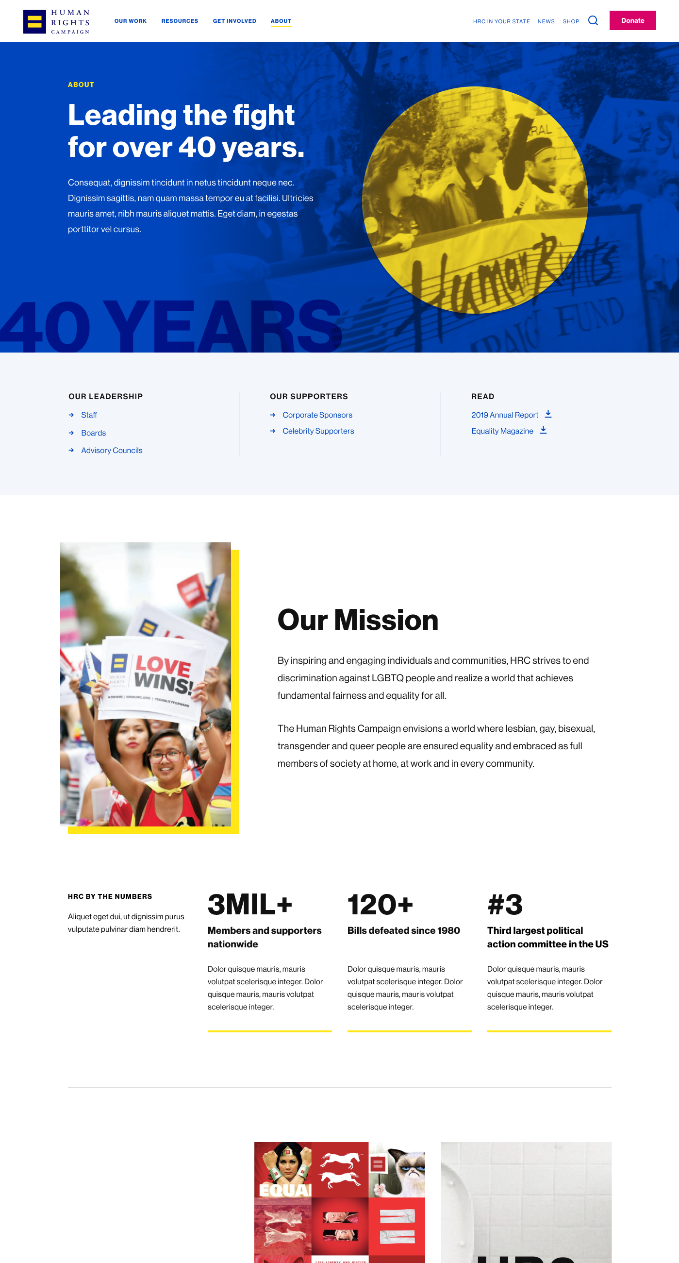
In discovery, stakeholders and web visitors stated that the site was not well-organized, and that it was hard to find what they were looking for. Through reverse card sort benchmark testing, I was able to identify some of the key problem areas and propose an updated data model and navigation. Some of the key things I considered throughout this process were:
- Reducing ambiguous labels, since the previous site contained top-level navigation items like “explore” and “HRC story”
- Creating pathways to popular content such as events, which previously didn’t have a clear “home” on the site.
- Separating the 501c4 and 501c3 entities of the organization into two distinct websites.
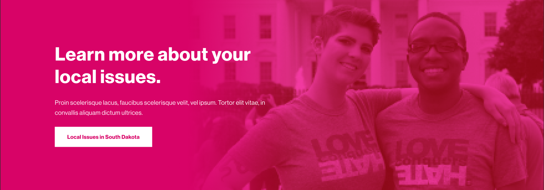
Because most visitors (76%) entered the site through resource and blog content, it was important to foster effective pathways for visitors to learn more about the organization. As a result, I proposed tying content that visitors were seeking out to specific campaigns, success stories, and state-specific initiatives as a way to entice visitors to take the next step.
Translating Content into an Accessible Format
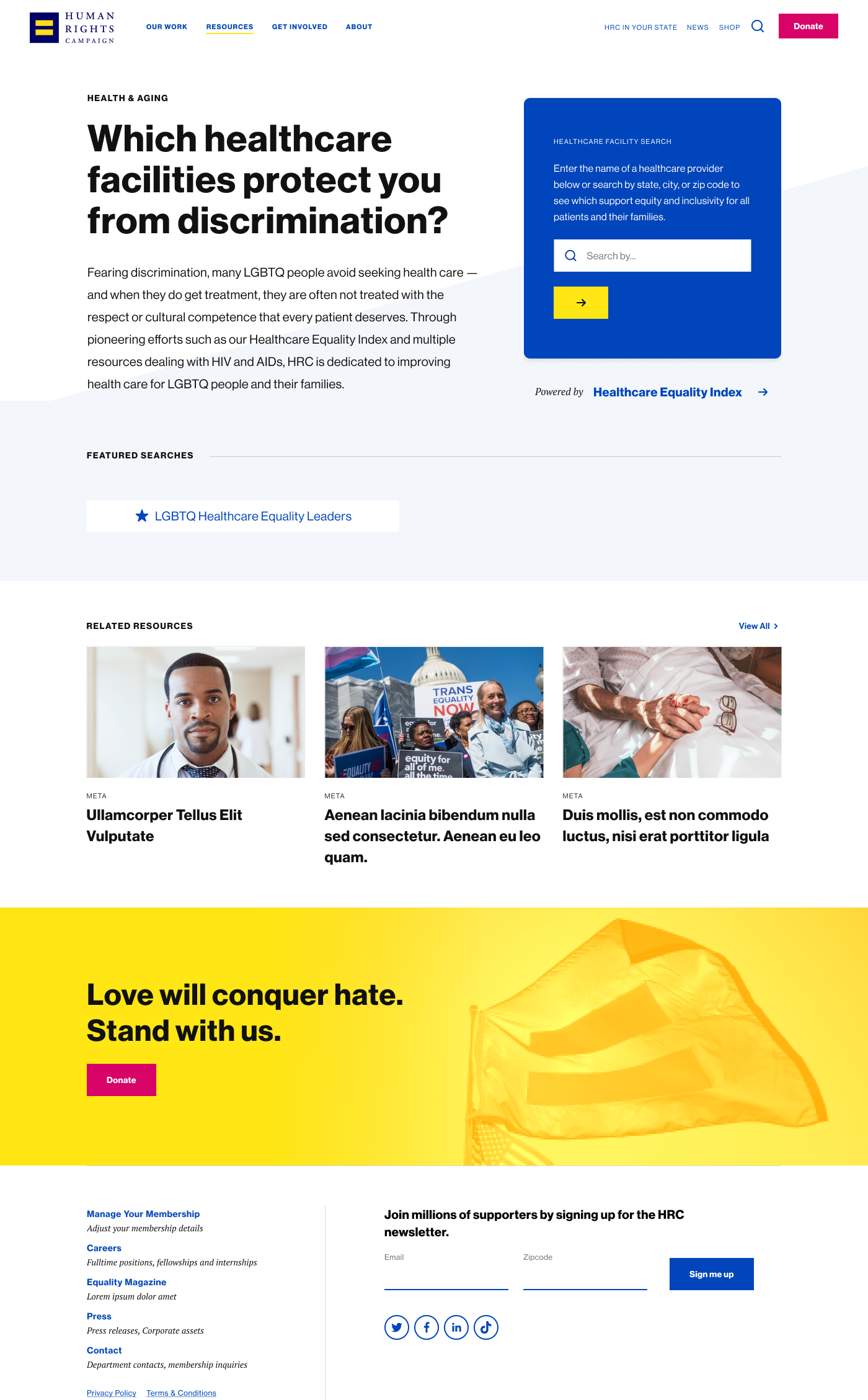
Some of the most powerful content HRC produces are the equality indices and data explorers. Equality indices are reports which rank entities like municipalities, hospitals, businesses and state representatives on their stance on LGBTQ+ rights and track trends over time. Data explorers are interactive versions of these reports, which allow visitors to search for specific businesses or hospitals to help them decide, for example, which healthcare facility to visit near them.
On the old site, equality indices were only available in PDF format, and the data explorers were clunky and inconsistent in how they displayed key information. In order to showcase this vital information, I created a flexible template for pulling key information out of the Equality Index reports, and created a consistent experience to allow easy browsing of the Data Explorers.
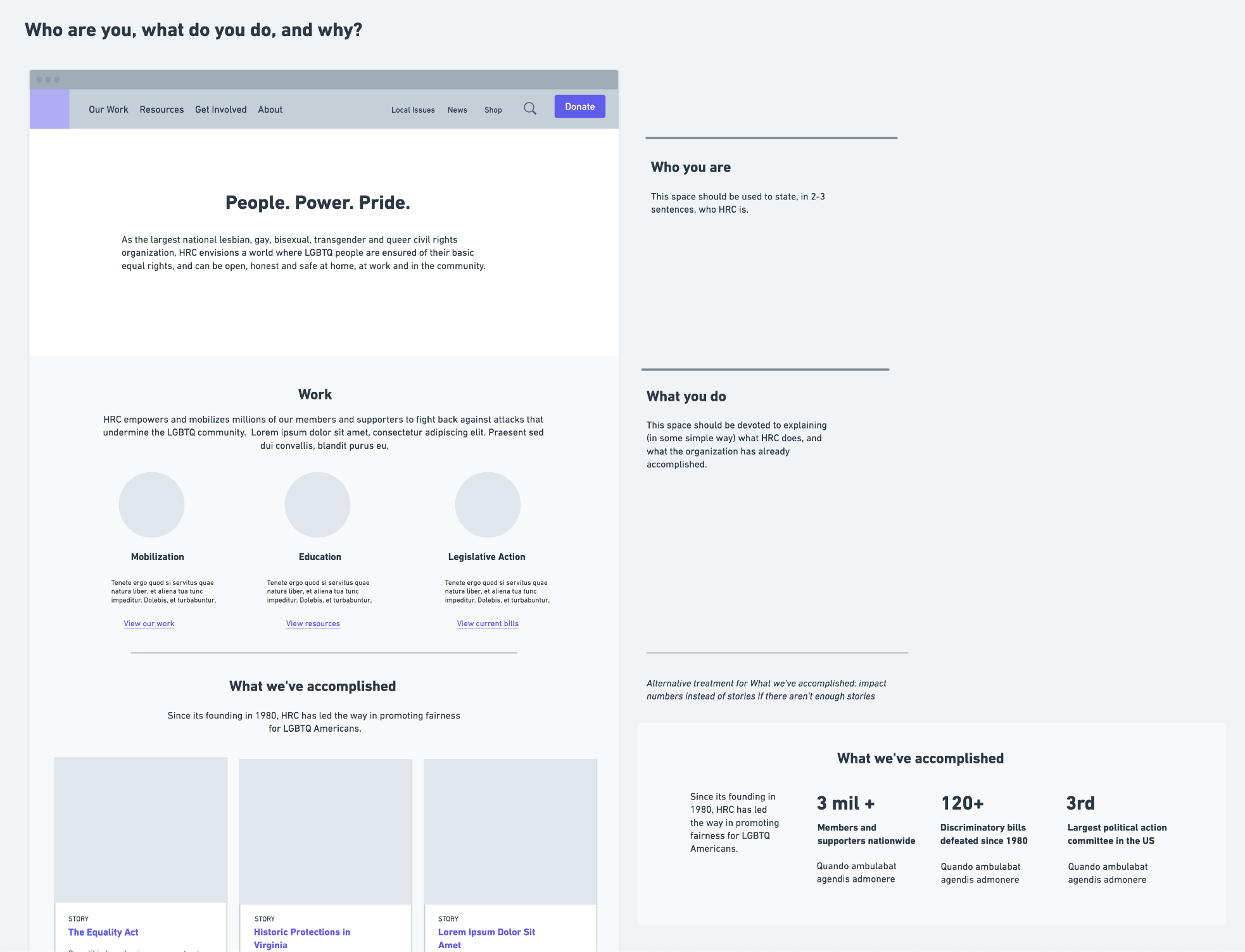
Communicating identity
79% of sessions to the site originated from new visitors, and in discovery, respondents were at times unsure what exactly HRC’s role was. As a result, it was important that the new site effectively communicate who HRC is, what they do, and why. While only 5% of sessions started on the home page, it was one intuitive location for high level information about the organization and their work, so I proposed redesigning the homepage to drive home key points about HRC.

