overview
Since 2009, the Ad Council and USDA Forest Service’s Discover the Forest campaign has encouraged parents and caregivers to take their families into the outdoors to experience and reconnect with nature. As part of this campaign, the Ad Council developed DiscoverTheForest.org, where parents who saw PSAs related to the campaign could learn more about connecting their kids to nature.
As the lead designer on a small cross-functional team, I reimagined the outdated website as a tool for parents and guardians seeking to introduce their kids to the outdoors, and addressed the key challenges identified as barriers to getting outside.
Client
The Ad Council and US Forest Service
Scope of work
Reimagine the experience to empower parents looking to take their kids outside
Outcome
Reduction in bounce rate from the site by 15%, and a 20% reduction in exits from the homepage alone.
the problem
"The great outdoors" feels exclusive and forbidding for a lot of parents
Discover the Forest was built to support busy parents and caregivers of 8-12 year-olds with a low level of previous experience with activities outdoors. To this audience, the idea of visiting nature felt both daunting and cumbersome. Through both a review of existing and some independent research, the team identified three key challenges that the new website would need to help the audience overcome to effectively plan an outing.
Convenience
Worry about having to travel a significant distance, or spend a lot of time planning activities for an outing.
Cost
Feeling like an outing might require buying expensive outdoor gear, or paying an entry fee
Comfort
Concerns around being underprepared, staying safe, and knowing what facilities are available.
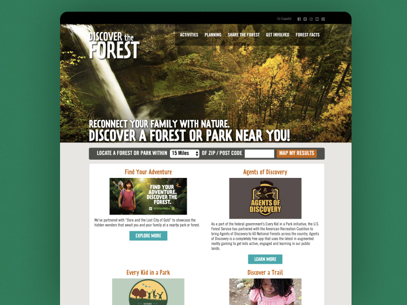
The existing site did little to address the concerns that parents had, lacked clear focus, and acted largely as a repository for a host of inconsistent content.
the approach
Make it easy for parents to plan an outing in nature that their kids excited, doesn’t break the bank, and feels safe and accessible.
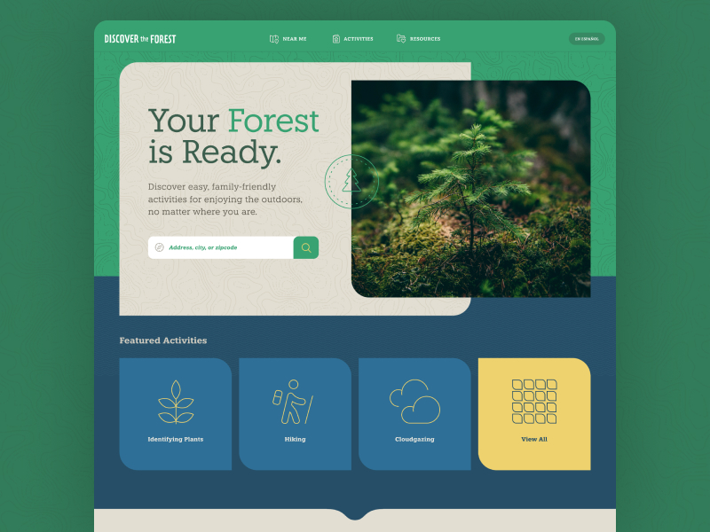
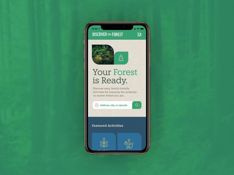
Working closely with a cross-disciplinary team, we introduced the concept of Your Forest is Ready. This concept centered on rebranding nature not as far-off wilderness, but every parent’s back yard or local park. Based on the concept, I reimagined how the site might prompt and enable parents to take their kids outside.
A storyboard I created for the new experience to communicate how the site could prompt and support parents in getting their kids outside.
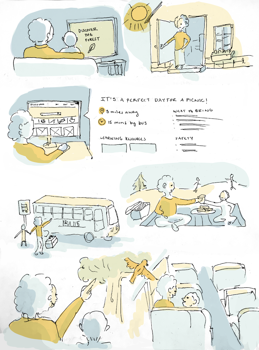
Making the outdoors convenient
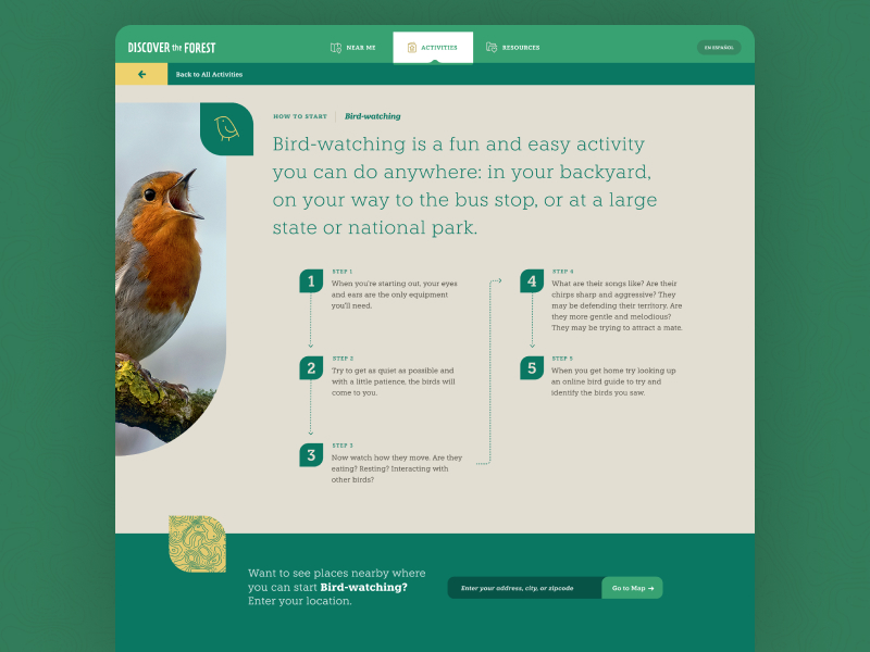
To make it easier for parents and caregivers to find an activity or place outside that’s right for them and their circumstances, location, and interests, I created structured relationships between listed locations, activities, and available resources. This meant that a site visitor could start exploring by location or activity, and easily find related worksheets and other resources based on the type of activity they are interested in.
A diagram showing how each of the content types could be used to discover complementary information

If a visitor wanted to browse by location first, they’d easily be able to see what activities they could engage in at any given location. Conversely, a visitor browsing activities first, say for birdwatching would see both related resources (a birding app) and be prompted to look for nearby locations where they could go birdwatch.
Reinforcing low-cost or free ways to enjoy the outdoors
In order to reinforce cost-free options, I brainstormed and prioritized creating content around a number of activities that were both location-agnostic, and focused on exploring or observing nature rather than engaging in traditional recreation.
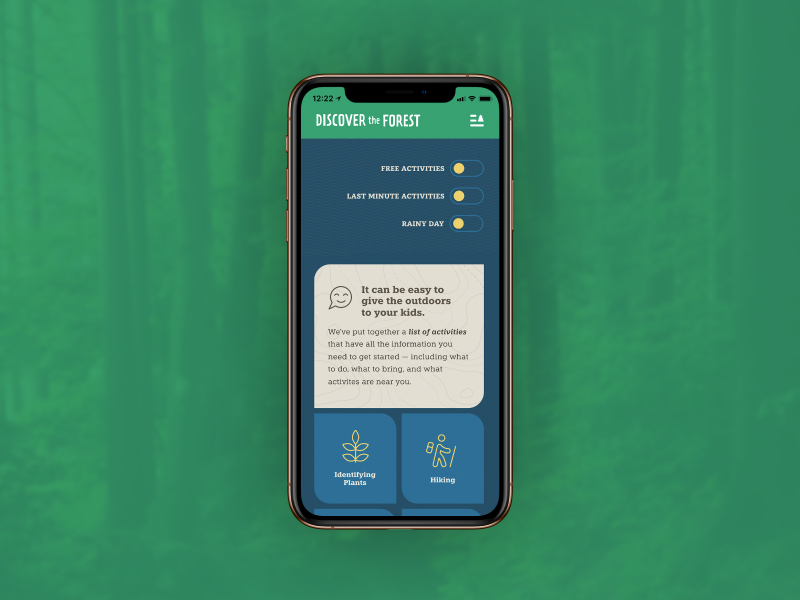
On the activity listing page, I also added a toggle for free activities, rainy day activities, and last minute activities, to reinforce that the options available to parents and caregivers would be cost-effective and easy to engage in.
A spreadsheet of activities I put together for our content designer

A spreadsheet of activities I put together for our content designer
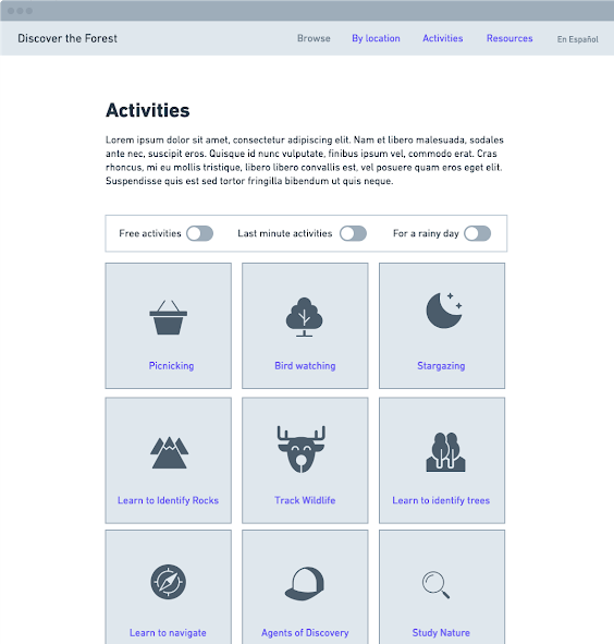
Helping parents feel prepared
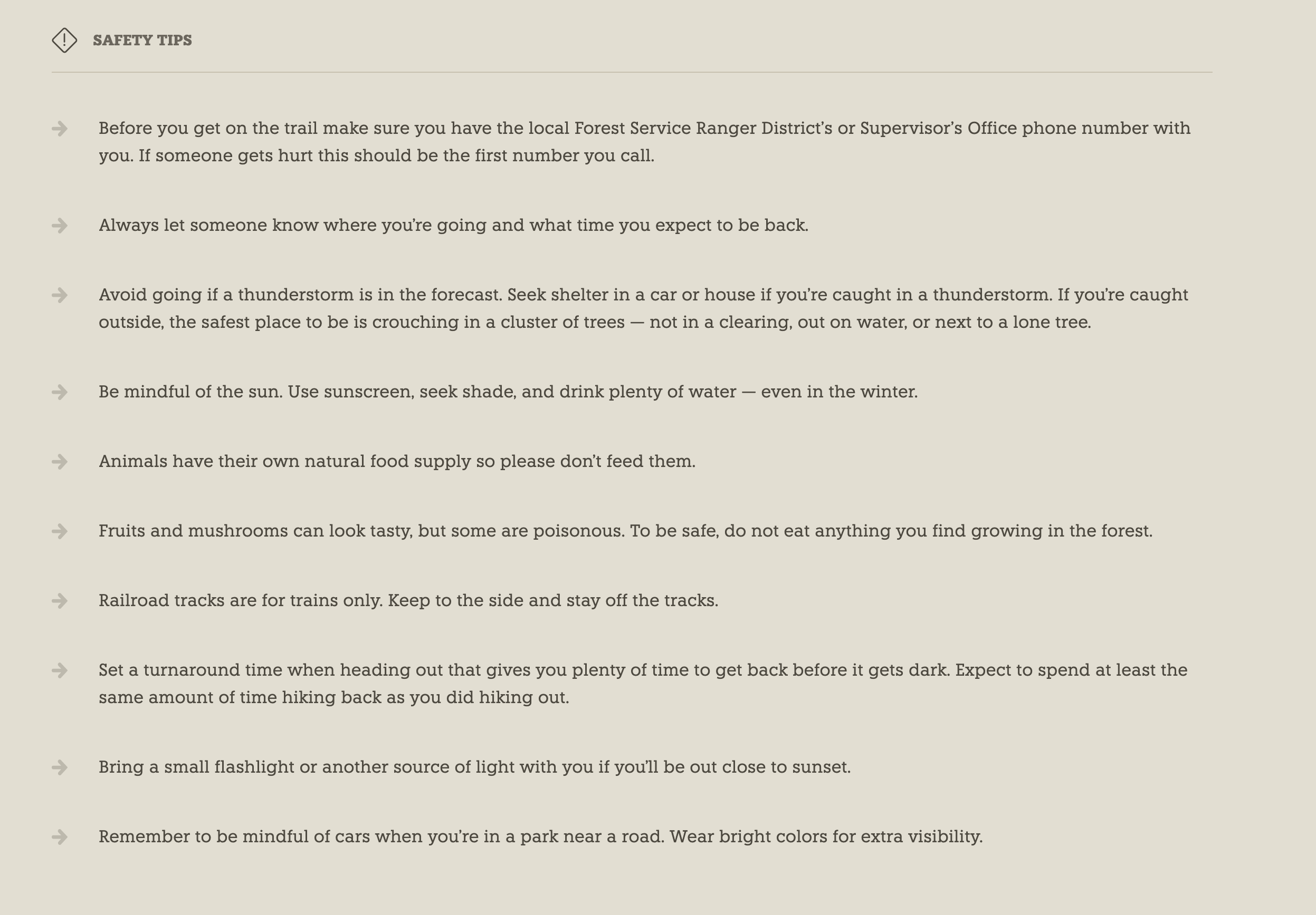
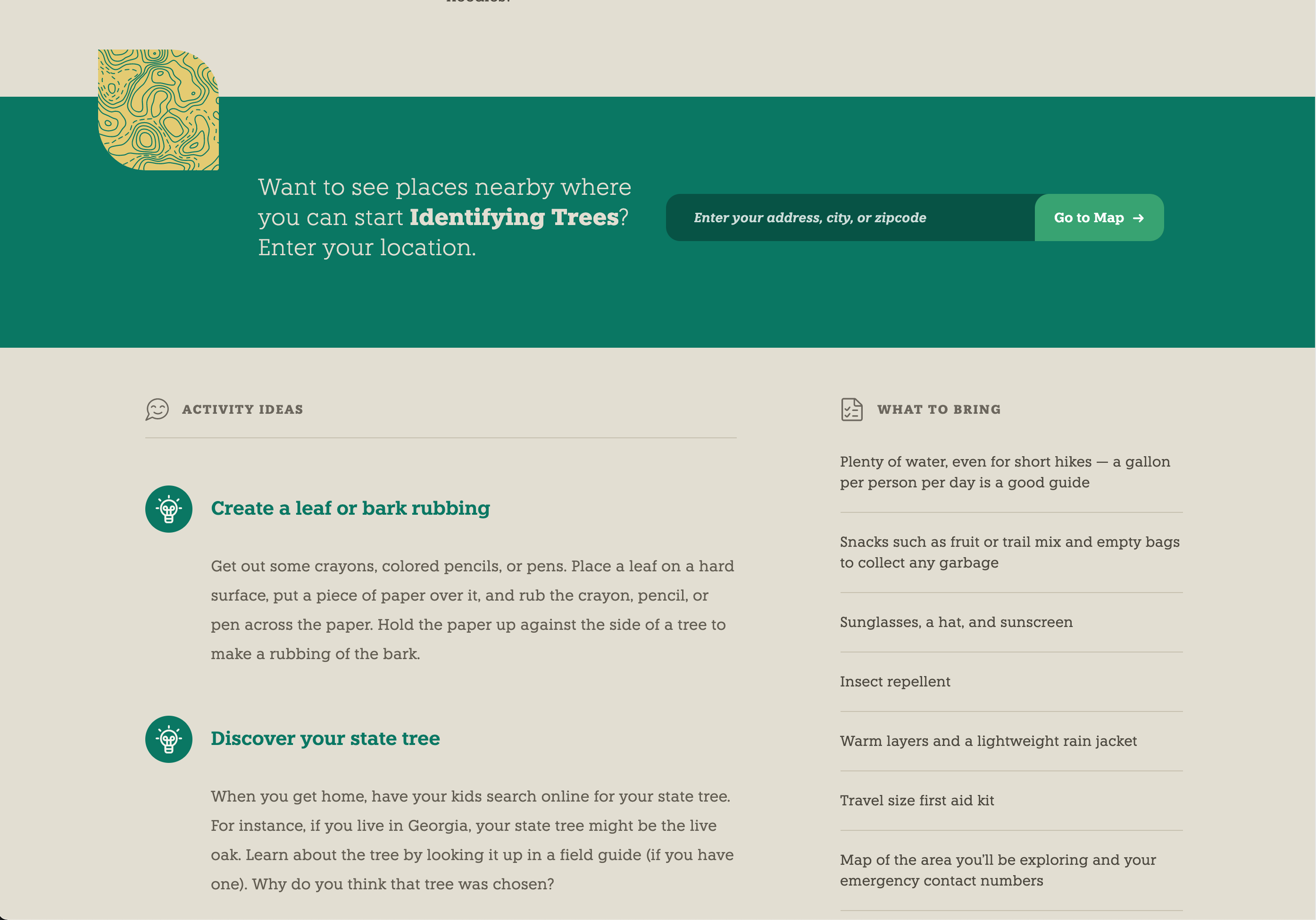
As a way to reassure parents and caregivers that they can comfortably engage in their chosen activity, I added a packing list and safety tip content sections to both provide an easy reference, and reinforce safe behaviors. Having the safety tips attached to activities rather than as a separate list meant that the safety tips could be tailored to the activity.
Safety tips were created as individual bullet points that could be added as needed to each activity

The Result
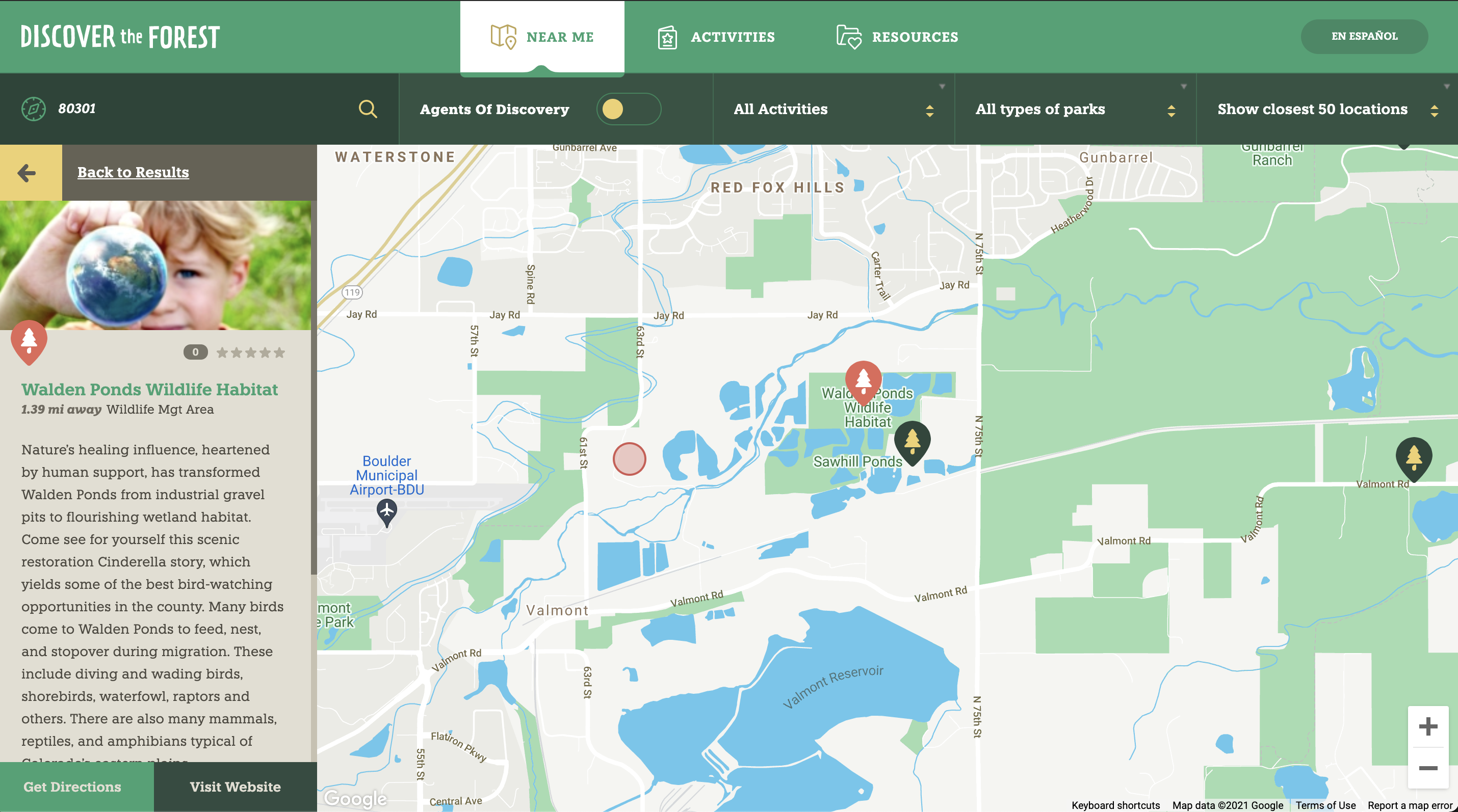
The refreshed website is a tool that supports parents looking to take their kids on an outdoor adventure by providing activity ideas, surfacing nearby parks, and providing resources for exploring nature.
After the release of the new website, the overall bounce rate for the site dropped from 80.82% (August 1, 2018– August 1, 2019) to 65.08% (August 12, 2019 – August 12, 2020). In the same time periods, 58.87% of users exited after viewing the home page on the new site, as compared to 82.93% on the old site, and users spent an average of 3 minutes on the map page of the new site, as compared to 57 seconds on the old one. Based on these results, it is clear that the new site kept visitors engaged with the content longer than the old one.


