overview
Client
AllTrails
Scope of work
Update map controls and elevate the navigation experience by reducing the cognitive load of map reading for members who glance at the app during key navigation decision points on the trail.
Outcome
The new navigation mode resulted in a 1% net (12% relative) increase in week-1 retention for users navigating in their first week. Additionally, unified map control states were defined across iOS, Android, and web and documented for future reference.
the problem
A neglected part of the product experience
When I joined AllTrails, the map, while arguably a key part of the product offering, was rife with issues. The map controls and their behaviors were inconsistent and trail-goers found the navigation mode to be confusing.
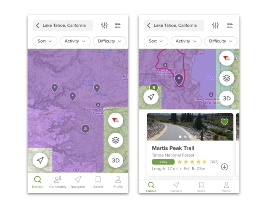
The map controls took up much of the available map space, especially on smaller mobile devices
The map controls behaved inconsistently across different platforms, and in ways that customers didn't expect
Trail goers struggled with the navigation experience, confusing it with the myriad of other map views within the product
Map controls that take up too much space
The map controls took up an oversized amount of space on the map, especially on smaller devices. Both internal stakeholders and external trail goers expressed wanting to see more map across the product.
Unintuitive iconography
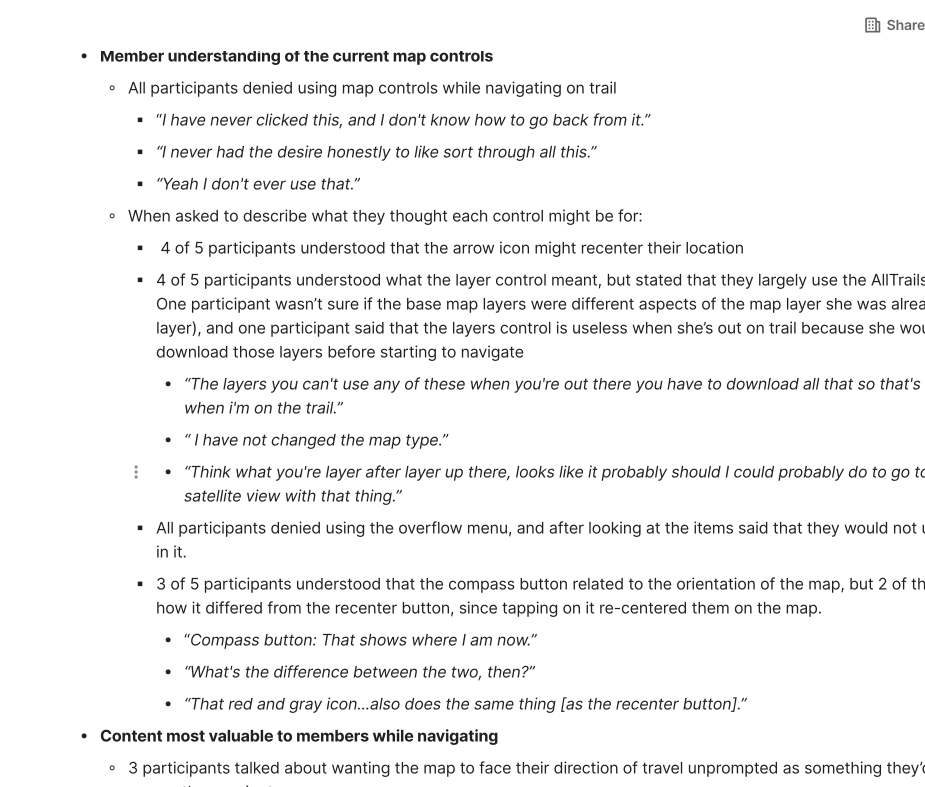
The intended use of each map control was also not obvious to trailgoers. Through moderated interviews it became clear that most users of AllTrails didn’t use the map controls at all, and when they did, their ability to correctly identify what each button did what was relatively low.
A navigation mode that doesn't help users navigate
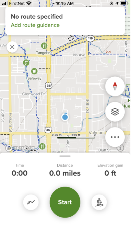
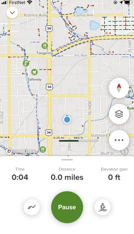
When a trailgoer started navigation mode, the map did not change at all to help support the act of direction finding. Because the navigation mode was so similar to the regular map, participants in moderated testing often weren’t sure whether they’d entered navigation mode.
Before starting navigation mode
After starting navigation mode
the approach
Create a dedicated navigation mode to help trailgoers stay oriented while out on trail. Define unified map control states holistically across the product to improve usability and free up map real estate.
From moderated interviews, it was clear that the existing navigation mode didn’t really provide additional value to trailgoers leading to a large drop off in use after the first time. Additionally, users largely denied using the map controls.
To promote on-trail usage of the product, I proposed creating a dedicated navigation mode that would start by default when users hit “start,” and help users stay oriented on their route. This new mode couldn’t exist in isolation, however, and since the existing map control states were inconsistent and confusing I proposed an update to the overarching map controls across the product to create a consistent experience. I also A/B tested iconography in the controls to improve overall information scent among users.
Auditing the competitive landscape and sketching possible navigation models
To start, I audited a range of navigation and mapping applications to identify the most common patterns for iconography, map states, and overall map control behavior.
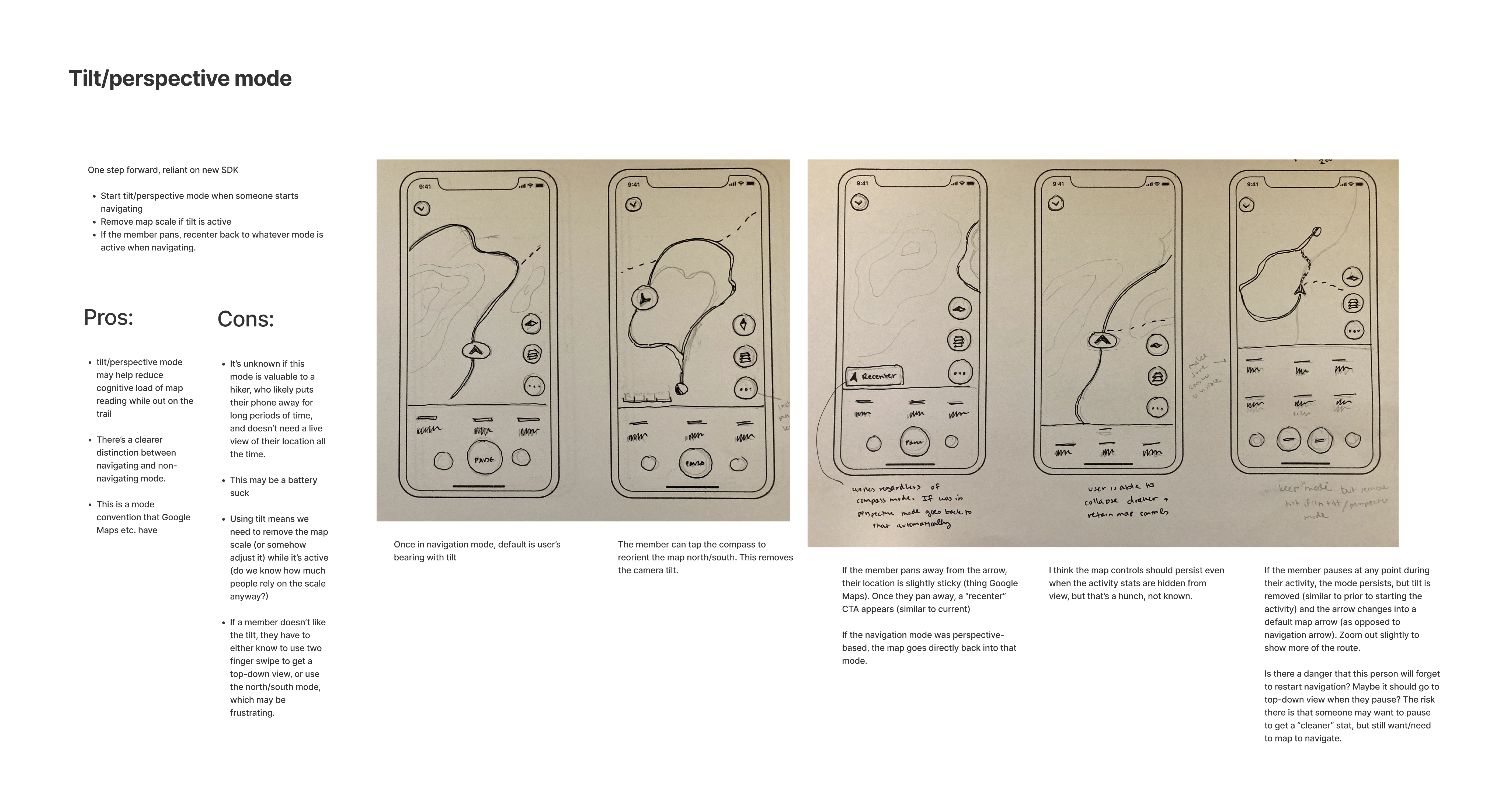
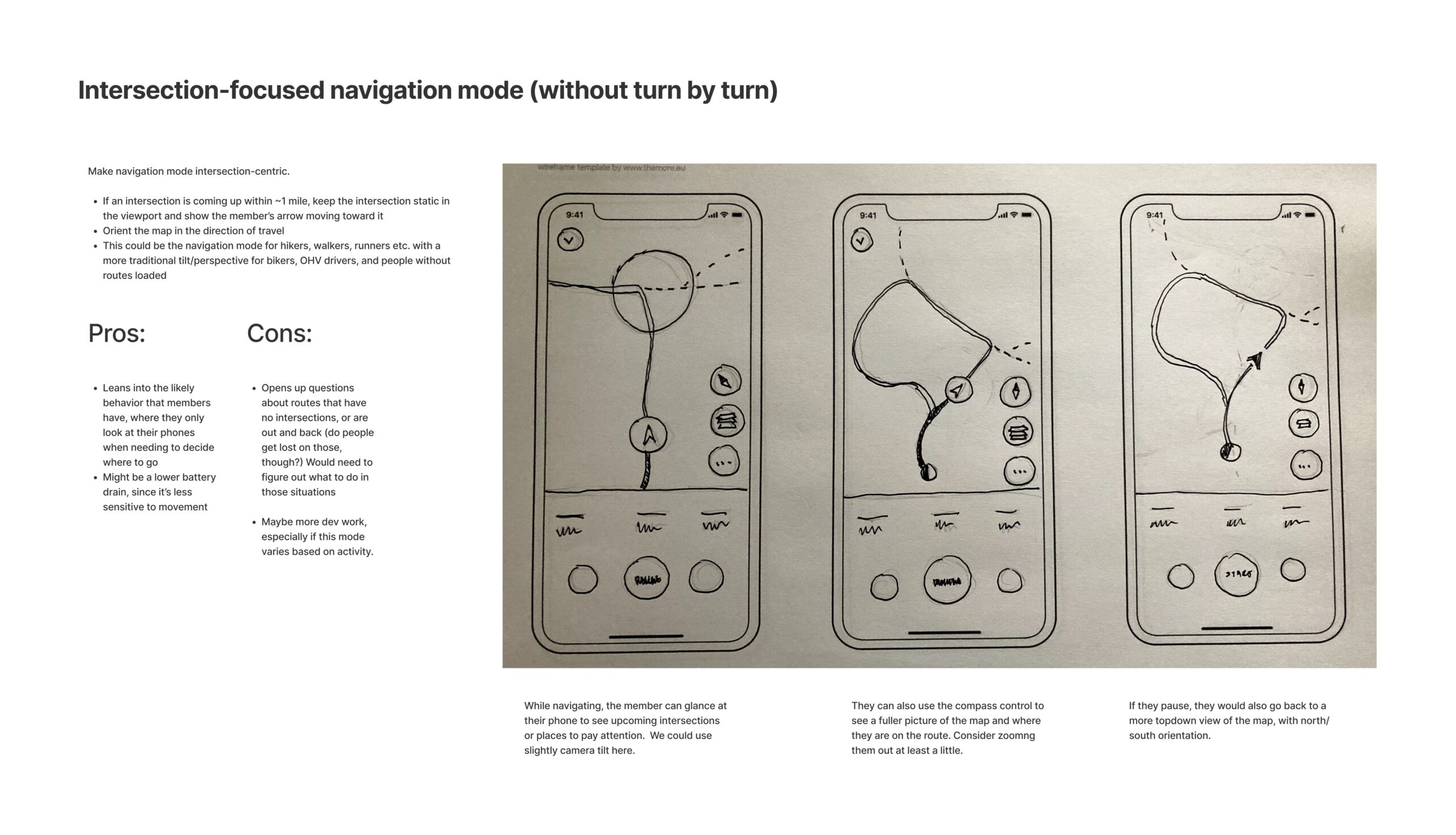
Next, I explored different navigation and map control options on paper. From research, I had learned that users on average glanced at the AllTrails map while on trail about 5 times per navigation session. This meant that any navigation aid would need to help the user self-orient at a glance. Some ideas I explored included audio turn by turn directions, highlighting one’s proximity to the next turn to the map, and simply applying a map tilt and tracking the user’s orientation to help improve the glanceability of the map while navigating.
Testing each control to optimize comprehension
Participants in moderated research at times struggled to identify the intended uses for the existing map controls. Because of this, I decided to run quick unmoderated user testing with variant iconography to determine whether alternative icons would help users better understand what each control would do.
Through this process, I identified relatively small changes that drastically improved user confidence in map controls. For example, by adding an “N” for north in the compass, participants’ ability to correctly identify the intended use of the map control increased from 20% to 70%.
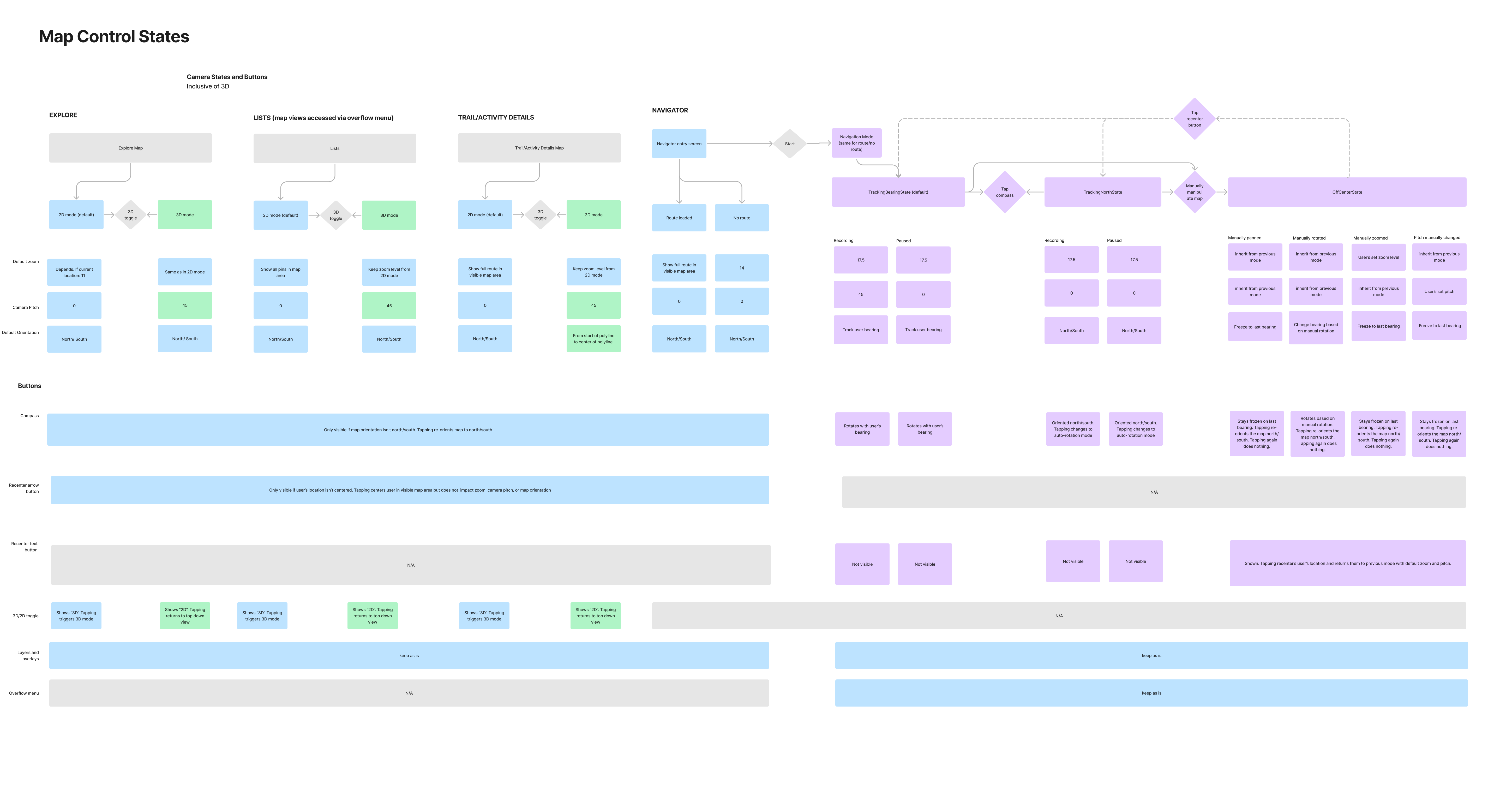
After sketching ideas and testing each map control, I worked closely with the development team to articulate and refine a set of map control states both generally in the product, and specifically during navigation mode to best support user confidence on trail. Some of the parameters I defined included things like camera pitch, zoom level, whether the user’s location was being centered. These states were then documented in a comprehensive diagram for future reference.
The Result
The new navigation mode resulted in a 1% net (12% relative) increase in week-1 retention for users navigating in their first week. Additionally, the overall core experience for the map controls was unified across iOS, Android, and web and documented for design and development for future reference.

